Free to Feed
Free to Feed is a not-for-profit social enterprise in awe of the potential and spirit of refugees, people seeking asylum and new migrants.
Free to Feed offers paid training and employment for refugees. They help them find a voice in the wider community.

-
UX Design & Content Strategy
-
3 week design sprint as UX Designer.
Free to Feed experienced rapid growth over the last few years and lost control over their user experience. Our task was to help them regain control and improve communication over their multiple customer touch points. -
Figma
Miro
Illustrator
Optimal workshop
ClickUp
Current feedback
journey map
Free to Feed provided us with some valuable customer feedback from people who’d participated in their cooking experiences. So we took their constructive insights and structured a journey map to get a better view of the problem areas.

-
Affinity Map

-
Empathy Map

-
Personas

-
Competitive Landscape

Problem Statement:
Maddy needs transparency in order to understand the social impact of cooking experiences.
Solving the problem
-
![]()
Crazy 8'S
-
![]()
Revamping IA


Testing the IA


Content Strategy

For Free to Feed to stay true to themselves and provide quality content without sounding like every other social enterprise out there. They also need to know how to spread their message.
-
Current User Flow

-
Proposed User Flow

Site Map

Low fidelity design concepts and testing
After we generated ideas and we had a “happy path” for our user flow and sitemap we were ready to start testing our ideas.
We wanted to see:
what people thought the site was about
what they thought the site offered
how they would book a cooking experience and what they expected to get out of one
how they thought the organisation made money and where they thought the money went
how they could be part of this organisation and volunteer
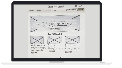


Mid fidelity design concepts and testing
Concept tested by 6 new users.

The solution
We had to make the mission statement even more obvious to understand. We tweaked the nav further based on IA feedback. People still weren’t sure where their money was going so we needed to work on this.
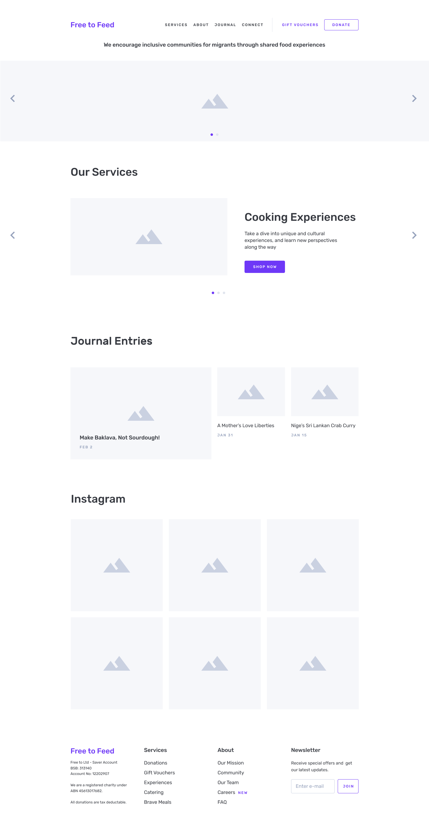
High fidelity prototype


