
Readings Kids: An online book store that gives you the touchy feels
-
If you’ve ever walked down Lygon street in Carlton, I guarantee you’ve popped your head into a Readings bookstore. Maybe you were on your way to a dinner date and had to buy some time, or perhaps you were looking for something unique that you couldn’t find anywhere else.
There’s no question that Readings’ in-store boutique experience is just that. A unique and engaging experience. So why is it that their online store falls a little flat? They still sell the same products. They provide the same recommendations. Readings believe that if we can understand the customers’ buying journey in relation to children’s books better, then we can give their users a beautiful experience online. That’s where we come in.
-
Victoria Murphy Role: UX Designer
Student project at General Assembly -
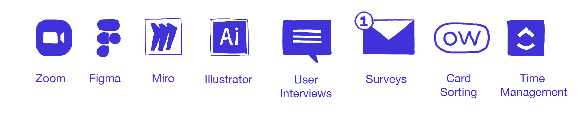
Market Analysis, Personas, Storyboarding, Card Sorting, Usability Testing, Low fidelity mockups.
Design and Research Tool Kit
The Approach
Using the tools above as well as following our Project Plan and the double diamond, we followed the tasks below in order to discover & define the problem so we could develop and deliver the solution.

Creating the framework
Before kickoff, the following structure was created in order for our project to run smoothly. In my experience, spending the time setting up this framework can save you time and a lot of headache. Working remotely meant that we each collaborated on a live document (Miro) together to share ideas and insights throughout the project.

My Role
In this project I was responsible for the Primary Research phase of the process. I conducted 8 (1hr) user interviews which were conducted over Zoom. I felt ownership of the Synthesis stage because I felt a real connection to the research. Having this insight into the users behaviours allowed me to champion the personas and problem statement.
The team and I conducted usability testing via Zoom which was a challenge as it was our first time online, but a great learning experience. I also contributed to the iconography on the prototype. Although we each lead certain tasks, there was still a strong emphasis on collaboration.
The Discover Phase
Empathising and Understanding
What we already know…

Growth
Children’s book sales are growing at a rapid rate.This segment is currently 44% of all book sales in Australia(at the time of writing). So in 2019, Readings saw an opportunity to support their local community by allowing people to order products online. So… they created their own website.

Competition
While it works, they know they can’t compete with Amazon and Booktopia. They think they can compete in a different way, by focusing on a unique segment that hasn’t been served in this market yet.

Customers
While we don’t know exact numbers for this specific segment (Children books), we do know the number of our customers purchasing Children’s books in-store is higher than online. We assume this is because of the nature of Children’s books being purchased for, well, children, who need something visual.
Readings know who purchases their Children’s books

Research, Key Findings & Understanding the User
Our Goals:
Visit the current website to understand how the company presents its brand and business.
Generate user flows based on three competitors/comparable online experiences. Select 4 experiences and draw up flow.
Perform a task analysis of the three user flows
Market Research: Direct & Indirect Comparative Analysis
Booktopia
In 2016, Booktopia had an estimated marketshare of 6–7 percent. That has grown to 14% in 3 years. It now accounts for 14 per cent of Australian book sales and is the country’s biggest online bookseller. Basically, they sold one book every six seconds- that’s 5.5 million dollars in online sales in 2019.
The others
With a big piece of the pie being taken by Booktopia, Book depository and Amazon followed closely behind with online sales. Although these stores are the main players in online book stores, they still weren’t their competitors. Readings wants to give the readers a sense of quality.
What they say
“We’re not competing on price but rather, on what they can’t get from the other online retailers: consideration for their child and what they read.”

Looking at our direct competitors
These stores are bookstores (like Readings) that have a children’s section. They’re the local bookstores, the ones that cater for children of all ages, the ones with storytime events and the ones with enthusiastic and knowledgeable staff offering great customer service. Their unique selling point is their curated collection, their focus on the community and access to local authors.
Comparative Research with Department Stores
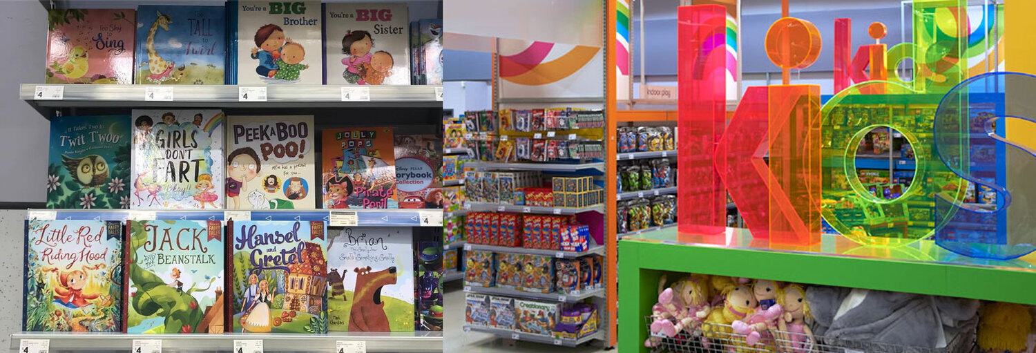
Kmart, Target and Big W each offer competitive prices like Booktopia etc, yet have an in-store experience. Apart from the low prices, their big selling point is front facing book displays.
Opportunities found
In-store book purchases
Front facing display of books (Visual Merchandising)
The ability to feel the weight or texture of the book/inspect the book
Online book purchases
Wide range of books on offer
Convenience
Good way to find book recommendations
Primary Research
User Research
Our Goals:
Conducting user interviews
Analysing interview findings then defining the user
Synchronising insights from affinity and empathy map
We created a Topic Map to find out from users:
-
1.
How the user is currently buying children's books
-
2.
What does a successful option look like to them? Are they happy with Readings kids stores or do they want online?
-
3.
What does a successful option look like to them? Are they happy with Readings kids stores or do they want online?
-
4.
Importance of cost to customer

The Define Phase
Synthesis of data
Affinity Mapping
Overview of our user interview group:
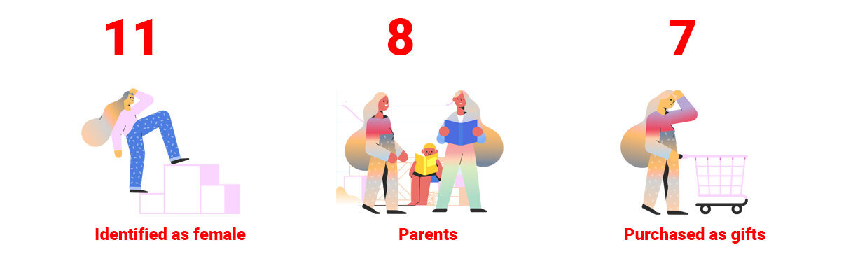
We recruited people that we knew that had either purchased a book for their own child, as a gift for someone they knew, or for their job in early education.
Recruitment: 14 user interviews. Median age was 31.
Interview Findings:
Synthesising our affinity map, we found 3 main trends and key insights from our users to implement into website.

Check it
Customers prefer to shop in store as they can check the content and materials of a book.

Nostalgia
Decisions could be influenced by nostalgia from childhood memories.

Categorisation
Customers also make decisions by age, author, genre or classics.
This is our Value Proposition.
Once we had our key insights from affinity mapping, we turned our insights into “I” statements to create an empathy map to help us define our personas.
Defining the User: Empathy Map

Synchronising our insights from our Affinity Map + Empathy Map into 2 Personas


Understanding the Problem
Customers need a way to more accurately and realistically assess the children’s books they are viewing online, so that they can feel confident in their online children’s book purchases.

Understanding the Current Customer Journey
Once we had our problem statement and personas, we decided to create a storyboard to visualise the problem.
The Develop Phase
How to solve the problem
Our next step in solving the problem was creating how might we statements.
how might we
Re-create the in-store experience online.
how might we
Visually show how the book looks and feels online.
how might we
Personalise the online experience of buying children's books.
how might we
Use a new way of labelling/ categorisation to communicate the physical feel and texture of a book.
Ideation
Crazy 8’s to generate ideas
With the user flows in mind
Brainstormed ways to link to existing site
Ways of displaying and previewing book
Different ways to show categories & checkout progress through icons


Hypothesis
“We believe that by providing clear and detailed information associated with children's book listings for our customers, we will be able to re-create elements of the in-store process involved when selecting a book, and provide the user with confidence in their purchase.”
Now that we know how to solve the problem,
how do we make it work?
Proving and Disproving the IA
Card Sorting- Remotely via Optimal sort

Based on our insights from card sorting we created a sitemap for the primary navigation, and focused our approach on creating the options for browsing by category and age group.
Site Map
User Flow


The Deliver Phase
Prototyping and Testing
Prototyping
From the ideation phase and our Crazy 8s, we felt like we had enough research and data to start sketching.


What worked:
Sort by Age
360 option
Multi-add options
What to improve next:
Affordances in search result page
Suggested items on product page
Have detail view on product page only
Testing & Iteration

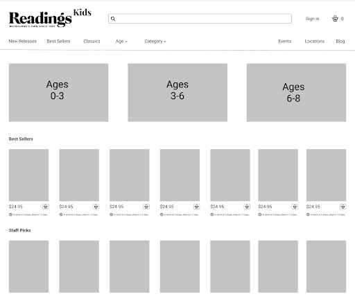


Mid Fidelity Prototype

Home Page
In this iteration we considered how we might link readings kids to the existing website.
Breadcrumbs: Landing > main > back > kids

Categories
On the home page,The books are categorised by ages 3-6. You can also sort by category and filter by most popular, authors or specific content tags.
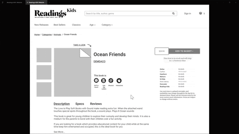
Features
Kept a lot of the typical features including writing reviews. Next up- we built hi-fidelity mockups of some of our key frames.

As per our research we included icons to help describe:
how it felt to touch
what the size was
other important sensory elements


Next Steps:
Home Page/UI
Continue working on the home page. Specifically the age category blob sections. These need to be more thought out and then tested.
Content Strategy
Create a Content Strategy that touches on our design language.
Test, Test, Test
Visit a Readings kids store and test the prototypes out with customers.
Build it
We would approach Readings to try and build our designs and test how it went.
Retro
What went well
Creating the right systems and infrastructure made this project run really smoothly. We each knew what was outstanding and what was ahead of us.
Collaborating online. Conducting user interviews and user testing via zoom meant that we had to be really efficient with time. Due to working during COVID-19, most people were already in front of a computer all day, so we had to be really clever with how we conducted things so we could get the best out of everyone.
What didn’t
Working through COVID-19 kind of stifled our creativity at first. It took us a couple of days to feel comfortable collaborating via Miro. That said, we did well.
Working to a strict timeline meant that we didn’t get to run through every design decision. Things would just sort of get done. It would have been great to have a little extra time to run through some of the ideas but we just didn’t have the time to work together in the Deliver stage. We just had to get it done.
Final thoughts
For our first remote project we did an incredible job. We had great insights, really understood what the audience needed and knew how to deliver it. Our group chemistry allowed us to work in a fluid and creative way without hitting any walls.
Our main focus was to have great insights and a sound understanding of our Audience and Primary Persona and I know we got that.